

Client wireframes for Market Research tool

Our proposed wireframes for Market Research too
summary
Timeline: 3 weeks
CHALLENGE: RentHub had an idea for a new market analytics tool to accompany their existing product. This new product would allow users (multifamily real estate investors, acquisitions managers and developers) to conduct research on potential real estate investments to determine if they should proceed with a deal. Our goal was to provide interaction design recommendations through initial wireframes, prototypes and usability testing results for this new product.
PROCESS: Research played a large role in this project. My team spent almost an entire week of the three week timeline conducting user research, domain research and competitive analysis. We spoke with real estate professionals to understand what tools and products they’re currently using and what they would like to see in a market research tool. We investigated the products that these professionals are currently using to determine what was working well and what could be improved in a new tool. We also studied data visualization best practices in order to ensure that the data we were showing could be easily understood by users. Taking our research, we designed 3 divergent concepts to test; a dashboard concept, a tabs concept and a map concept. We used our concept test feedback to converge on a single concept and build out a prototype for testing. After one round of user testing, we were able to make some key iterations before handing the final wireframes and prototype off to our client.
SOLUTION: My team designed a product that was nothing like anything that real estate investors, acquisitions managers and developers have ever used. The CEO is currently using our prototype walkthrough video to pitch to potential clients.
[Click HERE to view the final RentHub InVision prototype.]
“The information itself, there are so many other products out there that have that. So what would draw me to this as opposed to those? One aspect is the data scraping, but the other thing that definitely excels is the user interface. It’s much prettier looking and I can see the map. ”
For more detail and visuals on this project, keep on reading below!
Renthub is a real estate data and intelligence platform that provides real-time pricing information and forecasts for rental rates to a variety of users including investors and acquisitions managers. These users utilize RentHub to keep track of their current residential portfolios and potential new investments. The current platform focuses primarily on multifamily residential housing, or apartment buildings, for those who aren't as familiar with real estate terms like my team was. Their key differentiator from other informational real estate sites is that they crawl the internet for real-time data. RentHub came to us with the idea of a new market research product to add to their suite. Their goal for this product would be to provide market data for corporate asset managers, developers and acquisitions managers who are researching potential real estate markets to invest in. Our goal was to figure out how a product like this would best fit into these users real estate deal cycle.
Research played a large part in the design. During our three weeks on this project, my team researched the ins and outs of the residential real estate market in order to figure out where RentHub could fit best fit in and then provide practical designs for our real estate users. This project taught me that it is crucial to have a solid understanding of the industry you are designing for. Without the proper research and knowledge of the industry, I would not have been able to make the valuable design decisions and recommendations that lead to our unique end product.
Understanding the Landscape
My team started out knowing almost nothing about the multi-family real estate industry. We jumped right into competitive analysis, domain research and user research in order to determine how real estate markets function, what the important pieces of data are that our users need to make decisions and what their current process looks like. We determined that RentHub has several direct competitors and even many indirect competitors. Much of their information was hidden behind user accounts, but we researched to find what their main draws were.

I plotted RentHub’s current competitors on a graph to identify where the opportunity was
Direct competitors: subscription based websites that provide economic data on a submarket and rental competition data
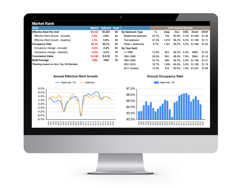
Axiometrics provides a portfolio comparison tool for users and supplies standard market data. However, their data is only updated weekly and some only once a month

Reis provides a heavy focus on submarket trends, rental comps and sales comps. Their data is updated weekly
Indirect competitors: websites that have a heavy demographic data focus

Trulia is targeted towards home buyers, sellers and renters. It provides data on affordability and demographics but does not allow the user to export the data
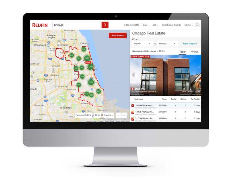
Redfin provides high level metrics by zipcode for home buyers,
sellers and real estate agents
These competitor names came up quite a bit during our user interviews. We had the opportunity to speak with several real estate investors about their current workflow and what information is important to them when researching a submarket for potential investment. Our interviewees mentioned that they’re currently utilizing at least 5-7 different sites to collect their data. Investors at larger, institutional investment companies often have subscriptions to sites such as Axiometrics or Reis where they get their hard financial numbers regarding a property or submarket. Investors at smaller companies are left to explore the internet on their own to collect the necessary information. Sometimes, a broker or operator may be involved in the early stages to provide a packet of information to the investors regarding a property or submarket they may be interested in. However, we learned that no matter how investors get their information they’re always double checking the numbers on their own because they may need additional information and they are skeptical of untrustworthy data.


During interview synthesis, each user that we interviewed was marked by a different color which allowed us to discover key, umbrella goals and frustrations.
We synthesized those goals and frustrations into three main takeaways.
1. Market conditions can change block by block. Users need a smaller view of the submarket.
“Submarkets are pretty broad. You’ve got to drill into the economics of the smaller area. How do I know if I’m on the right side of the tracks? ”
2. Data needs to be three (multi) dimensional. Users need to see data over time, with more than just averages.
“Spot value rent doesn’t mean much. That apartment is renting for $1,000 today, but tomorrow it could be $800 because prices fluctuate. ”
3. Users want the raw data and the source material.
“The biggest problem we have with CoStar is how they source their data. They end up doing a lot of estimates to fill in the gaps, which introduces distortions. ”
What this meant was that we needed to give users the flexibility to view the submarket, but also the ability to zoom in on a specific block or two. The numbers and demographics of nearby surroundings can tell a user a lot about whether or not they should invest in an area. Also, the data they’re currently collecting is very one dimensional. The information presented should tell the user a story about an area. Lastly, by giving the users access to the raw data, they are able to create their own graphs and charts if they want. It also starts to build trust because the users are able to see the exact numbers that were used to produce a chart, graph or average.
Throughout our research phase, we were constantly finding new domain research that would have an impact moving forward in the process. We consulted articles focused on big data and real estate, what attributes that make a “hot” multifamily market, and even building a trusted brand and actionable insights.


Defining the Problem
From our research, it was clear to us that users could get market data just about anywhere. No one competitor stood out to us over the others. RentHub’s only key differentiator at the moment is that they crawl the internet for data that is updated in real time. So, since every competitor has similar data, we needed to find a way to set RentHub apart in order to enhance user experience and attract new customers.
We narrowed it down and determined that throughout the cycle of a multi-family real estate deal, various stakeholders need an aggregated, trustworthy source of submarket data and analysis in order to market a property, verify provided information, and make accurate investment decisions.
With a limited pool of users that we actually spoke with during user research, it made it challenging to hone in on one specific user. We felt that with the right design, RentHub could be useful to a few different types of users. We chose to focus on four distinct users.

Can work for small to large companies, most likely has access to an Axiometrics or Reis to conduct heavy research to see if an acquisition is a good deal for employer

Typically works for large, commercial investment firm, may get informational packets from brokers about potential investment properties, most likely has access to an Axiometrics or Reis account

Works on his/her own, may get email blasts from brokers about potential investment properties, limited resources

Typically looking for acquisition properties that fit the specific model of the company they’re working for, they will receive an informational packet on a property from an operator and must conduct extensive research to determine if the property fits their model and will be a positive addition to their portfolio
We then took a deeper dive into their individual research process. We determined that each user follows a similar high-level process with similar goals and pain points along the way.

We walked through a typical deal cycle for each of our users and highlighted the similar goals and pain points
These task flows helped us to determine that all of the users are looking at similar metrics, it may just be at a different phase of their deal cycle. It is important for the data to be trustworthy for all users so that they’re not wasting time to verify all of the information. It also would be helpful if the data was all in one place so users weren’t wasting even more time hopping from site to site to compile it. Lastly, the users need control over the data so that they can customize it to fit their specific needs. Often times, users know exactly what they’re looking for but they have to sift through unwanted information to find what they need. For example, an institutional investor may only be looking at high-rise luxury apartments, while an independent investor may only want to see 3 story walk-up properties. We kept these insights in mind as we got closer to building out our designs.
Empathizing with our Users
Before jumping into design, we developed a set of design guidelines from our user goals and frustrations that we absolutely wanted to stick to when building out the product.


Relating back to our insights from our task flows, we wanted to give the users the ability to filter and customize their searches while still being able to build trust in the data provided. We also wanted to make sure that the data wasn’t flat. In order for RentHub to stand apart from its competitors, the data needed to have life and show progression.
Back to Research
There was one last phase of research we conducted before jumping into concept design. That was, understanding best practices when it came to data visualization. We wanted to make sure that we weren’t just throwing data at our users but rather, presenting crucial information to them in an aesthetically pleasing, easily understandable way. We learned all about overlaying information versus stacking it, providing clear legends and interactivity for charts and graphs and how user selections should influence all views. We studied examples of what people are doing and saying in the data visualization space, both good and bad. Some of these examples included Bloomberg with its’ overwhelming dashboard and Tableau with their customization and simple charts and graphs.

Bloomberg does a good job of drawing attention to important details via specific colors. However, for our users, we wanted to prevent the feeling of “information overload” that a user might feel when looking at a Bloomberg dashboard

Tableau does a great job of giving the user the freedom to turn their data into a visual. The charts and graphs that they produce are clean and easy to comprehend. Users are even able to add overlays to get additional information
With my new knowledge of data visualization best practices, on top of the user and domain research conducted earlier, I felt confident moving forward into the design phase.
Designing, Testing, and Iterating
Keeping our research and design principles in mind, we dove into ideation and concept design.
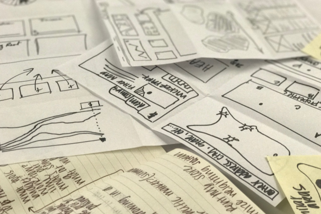
I completed a few rounds of 6-8-5 sketching to get some ideas out on paper
We wanted to give users 3 ways to obtain and review multifamily market. After some Brute Thinking exercises and sketching, we came up with 3 concepts.
Our first concept was a dashboard concept. The product manager for RentHub saw the research product as a Dashboard so we decided to build it out in a way that would give the users all the information they wanted on one screen, while still giving them the flexibility to filter and move around the individual widgets.
Our second concept was a tabs concept, which I built out. Since our users collect so much information in their research, we felt it would be helpful to organize the data into distinct categories that we heard mentioned quite a bit during research. These categories included high-level financials, demographics and comparable properties (comps). We also wanted to keep the map of the submarket visible at all times so that the user was able to easily zoom in or out to get different data.
Our last concept was a map concept. We thought that a full-screen map with overlays would give the user full range of flexibility to zoom as far in or out in a specific area during their research while still providing insightful information via overlays.
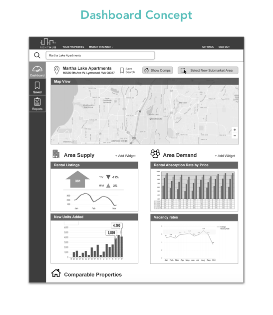
Dashboard Concept – highly customizable,
widget-based dashboard
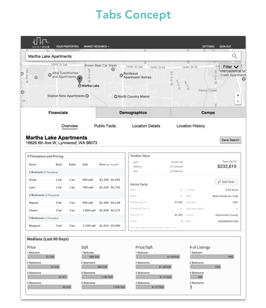
Tabs Concept – data categorized behinds tabs
for quick access

Map Concept – location-based data, scalable
to any level of detail
Our concepts included layouts that users had never seen before in a submarket research tool. They had some positive feedback and some recommendations during testing.
“I want to be able to see where I am on the map at all times. I don’t want to have to constantly scroll up and down between the data and map view. ”
“This supply and demand is great. That’s what we need to know. But I’d like to see demographic info here too.”
“Being able to combine data like this and see it all at once would be great. I could really get a good feel for the neighborhood. ”
After synthesizing our feedback from users about our concepts, we came away with 3 key insights for our designs moving forward.


Converging on a single solution took quite a bit of thought. Throughout our research and concept phases, we had gained an immense amount of information. We felt we had a good understanding of who would be using RentHub’s market research product and high level, what should be included, but it was time to get more granular. We categorized the features in order to build the information architecture for the product. We then had a strong understanding of how the information would be displayed, the hierarchy of the information presented, and which specific features to include in each section.
By taking the time to lay out the site architecture of the product, it allowed us to move forward with
a clear vision for the design
It was then time to turn our vision into a design.

We built out a split screen for the market research tool since it matched the user’s mental model already from competitors like Trulia and Redfin. We also knew that users wanted to be able to see the map at all times so this was an ideal solution for that. The right side of the screen would display the data in charts and graphs. The left side of the screen would mirror the selected data via a map overlay. Ideally, users would have the option to view multiple overlays at once
After a round of testing with our real estate users, we received some actionable feedback that we incorporated in our first round of iterations.
It took users a while to figure out that demographics was hidden within a drop down menu. We brought back
our “tabs concept” in order to make the navigation more visible
Users said that the comp set averages looked more like a header so we pulled them out to make them more visible.
Users also wanted to be able to filter and compare comps by number of beds and baths
.
Users wanted to be able to see how the comp they were looking at compared to the comp set average.
They also wanted to be able to see the trends over time
We added a “how RentHub works” section to give the users clarity into how RentHub sources their data so that RentHub can gain their trust
We added a “how RentHub works” section to give the users clarity into how RentHub sources
their data
so that RentHub can gain their trust
From user feedback, we concluded that our final RentHub designs gave the users what they wanted which was visibility, the ability to interact with the data, and detailed comp information. By giving the user a split screen view, it allowed them to flip back and forth between the map and data without having to change tabs or use physical documents. The interactivity with both the map and the data points gave the information a story and showed how the different data sets could be affected by one another. Lastly, demographic and supply and demand information are crucial to users when researching a property, but comp sets really tie it all together and give the user that last bit of information to make their decision.
The final handoff and next steps
After 3 weeks of research, prototyping, testing and iterating, my team delivered a product that will give multifamily real estate investors all of the information they need in one place. Our product drastically cuts down on the time it takes to gather information on a market and gives users the ability to interact with the data in a way they have never been able to before.
[Click HERE to view the final RentHub InVision prototype.]
During our final handoff presentation with our client, we assisted in a phase planning discussion. We were aware that all of the features we incorporated in our wireframes weren’t going to be implemented overnight. We took the time to list out all of the those different features of the market research tool and rated the impact it would have on the product 1-5 (1 being lower impact and 5 being high impact). We then had the developer rate the level of difficulty of those same features 1-5 and we plotted them on a graph to determine which features RentHub would implement first.

This phase planning exercise gave RentHub a clear direction for feature implementation.
We passed along the final annotated wireframes for future UX designers, UI designers, and developers detailing which features had been user tested and validated and which features still need further testing
Our clients at RentHub felt that we exceeded their expectations. They were impressed not only by the amount of knowledge we had about the multifamily real estate market in just three weeks but, the final product we handed over as well. The CEO is currently using our prototype walkthrough to pitch to potential customers.
During this project, I learned that if you don’t have a solid understanding of the industry you’re designing for, there’s a 99.9% chance that your designs won’t enhance the experience for users. The research phase of this project was especially important to our outcomes, which is why we spent so much time on it. I practiced valuable researching techniques that I’ll be able to take with me when designing for future clients in different industries.